Hello lovelies!
I am quite delighted to be back in this space, sharing more in the color psychology realm, this time with how it relates to branding. As with the other mood boards I have compiled, seasonal color psychology is the study of color and how it’s tones and traits are mirrored in nature and can be relatable to nearly every aspect of design, from interiors to fashion to branding.
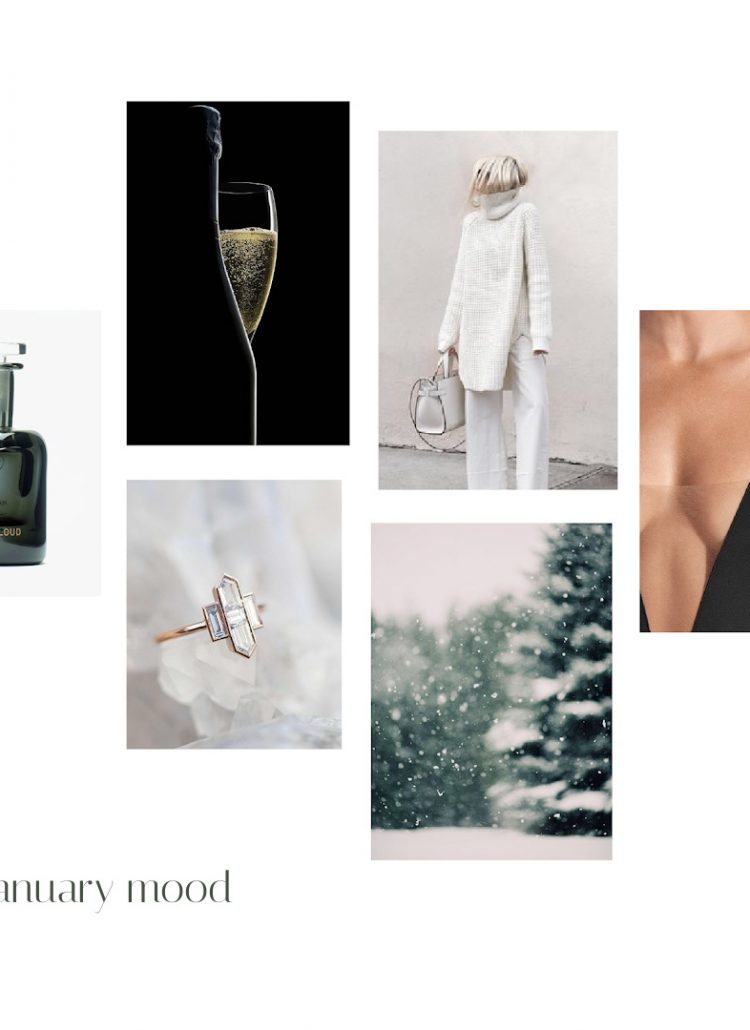
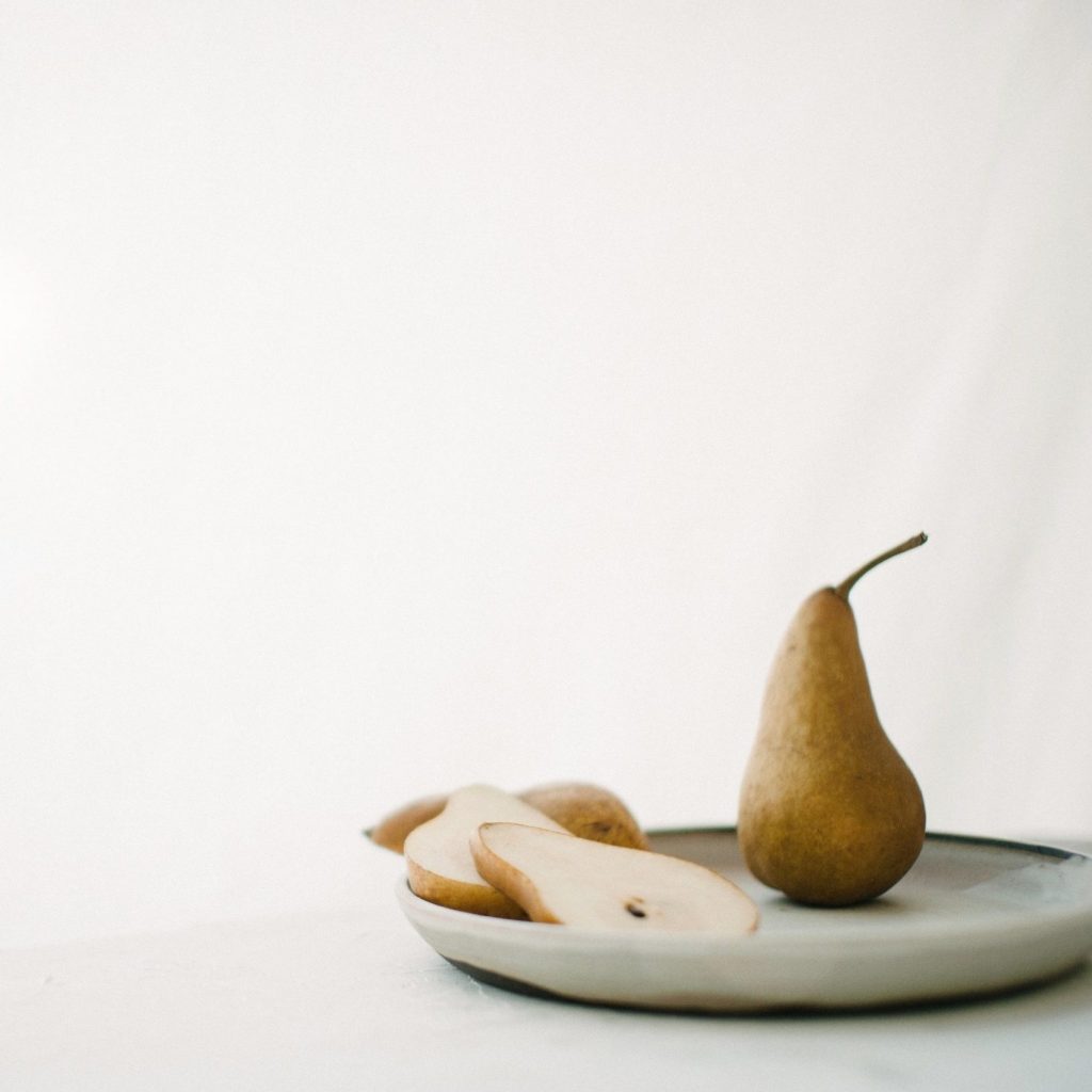
January is all about stillness, being reflective, deep rest, refocusing and illumination. When the sun reflects off the snow on a clear cold day, there is scarcely brighter light. Nature is the most at rest this month, the tree trunks dark against the blanketed snow. The evergreens green is the most pronounced in it’s monotone environment.
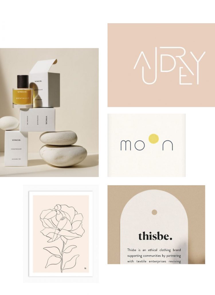
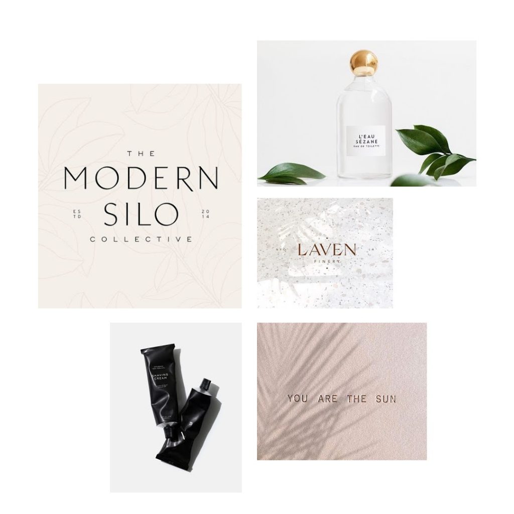
Elements that relate to branding this month are san serif fonts, clean and crisp lines, a sharp and contrasting mono color palette, exquisite typography spacing, reflective and editorial styling with uncompromising strength.
If your business seems to resonate with these words and images, then the month of January may be your perfect foil. It is elevated, luxurious, exacting and second to none in an ‘ahead of the curve’ way.
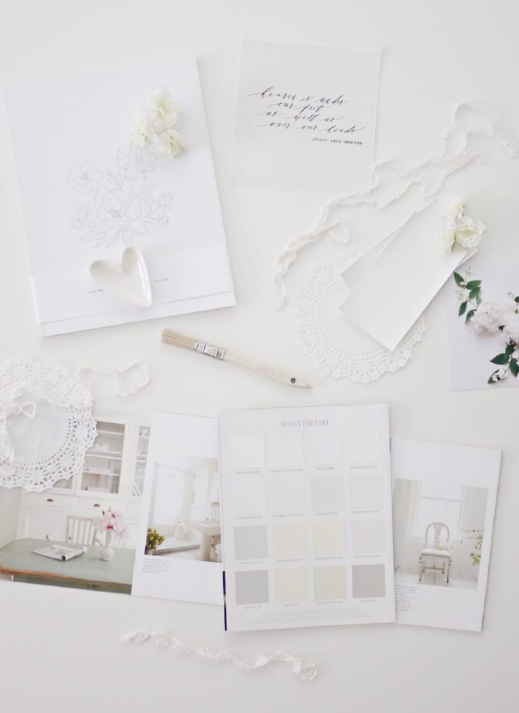
My first January moodboard is here, with this being the interiors version.
The credits for the moodboard images can be found here.
