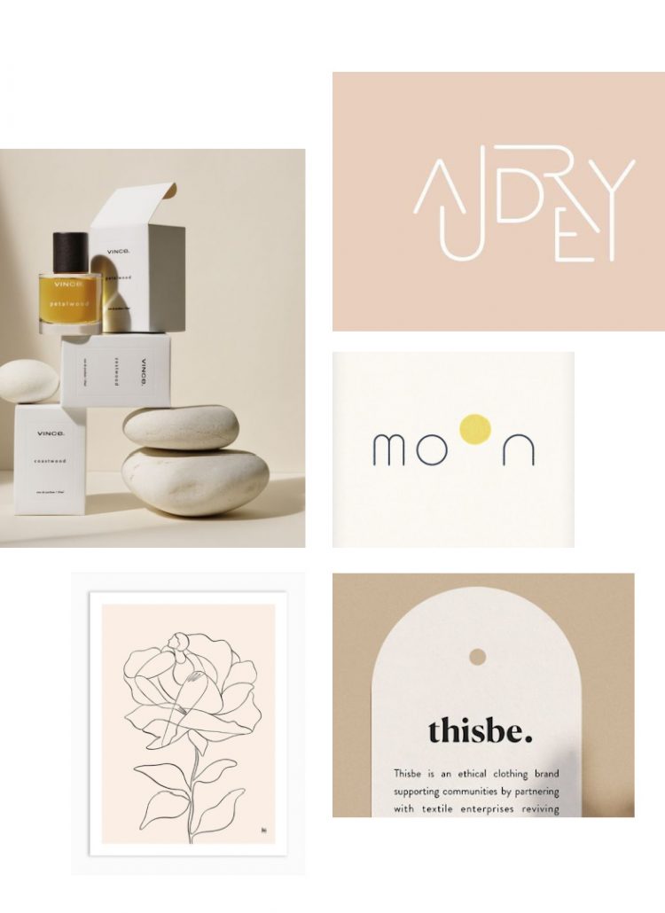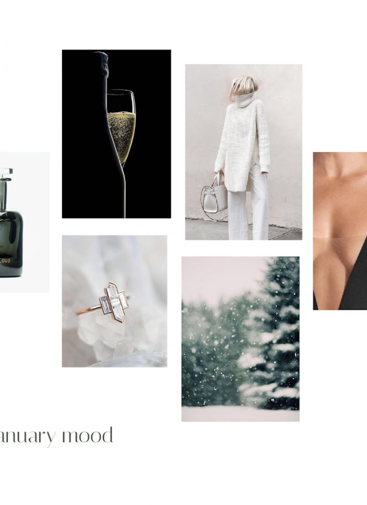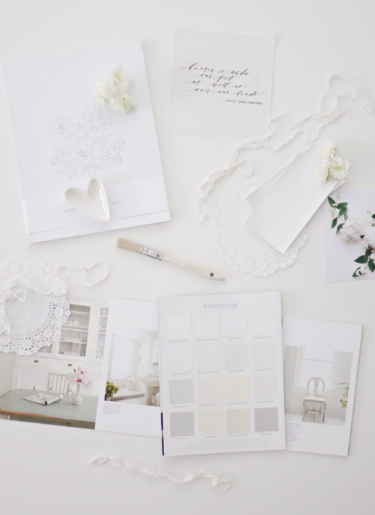
As we move away from Spring, the color palette cools down again which brings about a more orderly feel, however whimsical touches can still be seen which add a more lighthearted feel to this month. Elements also move toward being more symmetrical but still have a bit of a playful feel.
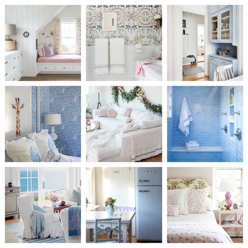
As a reminder seasonal color psychology is the study of color and how it’s tones and traits are mirrored in nature and can be relatable to nearly every aspect of design .. design in nature, fashion, interiors, print, florals, art etc. Here is the color psychology mood board for June, so you can see how they relate to each other.
Interiors for June begin to show more formality, but it is more artistically expressive then the month to follow. Florals and prints are becoming more consistent and delicate. Colors are light and dreamy. Bolder shapes begin to soften by way of flounced skirts, pillow flanges and fringing. Painted wood features strongly as well as glazed ceramics. June seems to envelop a summers day, whether it be the seaside, a flowery meadow or a rose garden. Watercolor artwork would suit these interiors well. June is perhaps the more idyllic of months looking through rose colored glasses.
This moodboard and the nine images shown are on my Pinterest board ‘colour psychology – june’ .. please explore the pins further if you would like to.
