Hello lovelies!
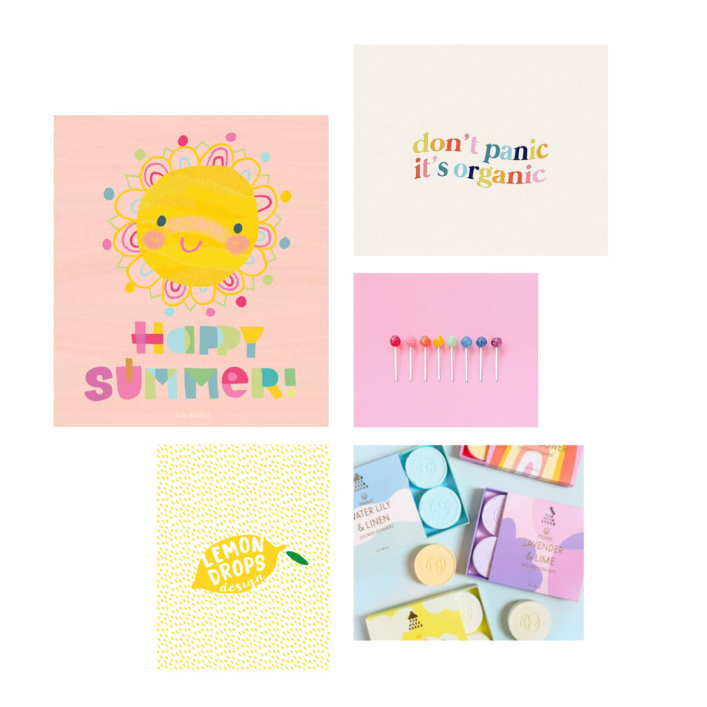
Moving on from early spring, we come to the most brightly colored month April, let’s consider once again how color psychology relates to branding. As with the other mood boards I have compiled, seasonal color psychology is the study of color and how it’s tones and traits are mirrored in nature and can be relatable to nearly every aspect of design, from interiors to fashion to branding.
Color is in it’s vibrancy in this mid-spring month; pure, bright and full of happiness. A reflection of all that is bursting forth with the season. Shoots reaching for the sun, ideas forming more clearly, a knowing that the cycle of growth has returned. Longer days, expectant outcomes and a stirring to get things done.
Elements that relate to branding this month are fonts with movement and enthusiasm, mostly in san serif; having a ‘let’s make the most of it’ vibe, nothing serious or fretful, fun patterns and a hand drawn aesthetic are key, pure colors, simple shapes, rounds abound, as does an overall energetic feel.
If your business seems to resonate with these words and images, then this mid spring vibe may be just the right fit for your brand identity. It is happy, pure, full of life, bright, fresh and spilling over with energy as no other month does.
The credits for the moodboard images can be found here.
