
Hello lovelies!
Late-spring brings with it a softening as the season moves towards summer; let’s have a look again at how color psychology relates to the subject of branding. As with the other mood boards I have curated, seasonal color psychology is the study of color and how it’s tones and traits are mirrored in nature and can be relatable to nearly every aspect of design, from interiors to fashion to branding.
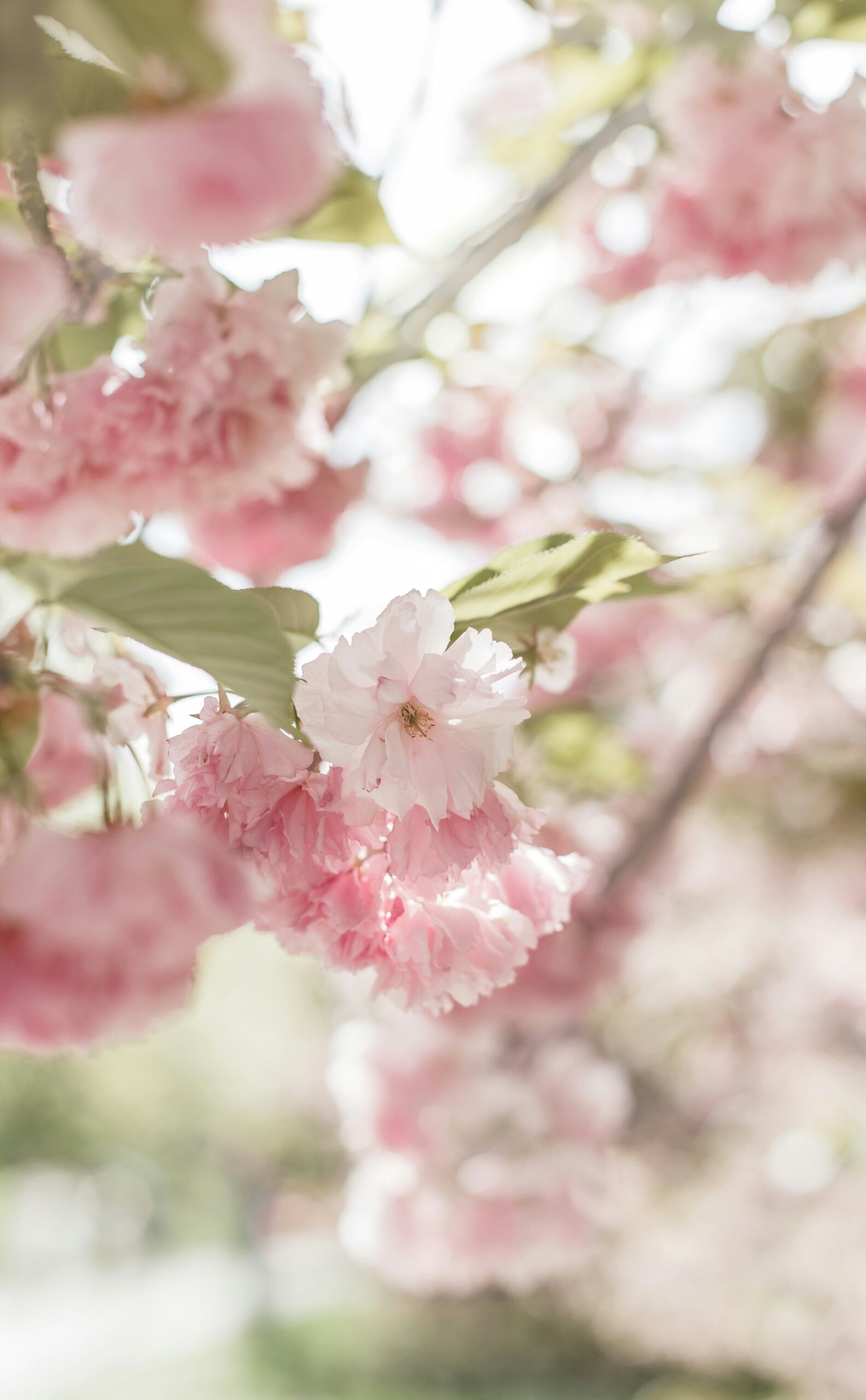
Everything begins to become more gentle as the season moves to the end of the exuberance of spring, color fades a bit, shapes begin to become a bit more flowing. There is still a youthful feeling, but it is less playful as the days become more steady. The speed of growth is slowing down a bit and soon the vibrancy and newness will plateau a bit more.
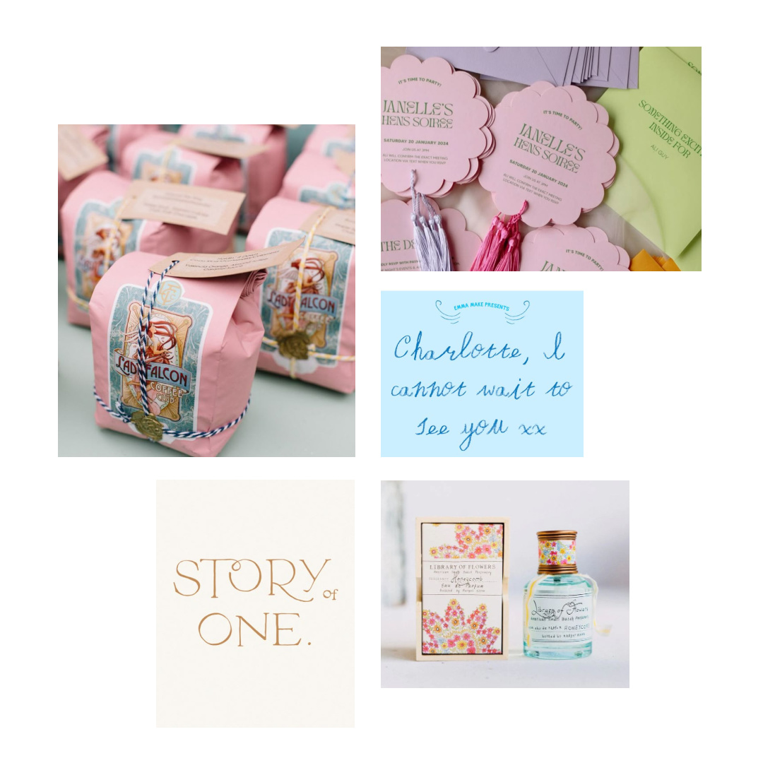
Elements that relate to branding this month are delicate fonts with a sense of melodic movement to them whether san serif or serif, curved shapes, floral inspirations, a bit of sheen and glow as well as a bit of whimsey and lightheartedness are apparent. Details become a bit more complex and numerous and there is still a youthful feeling, but it is less playful and simple.
If your business seems to resonate with these words and images, then this late spring vibe may be just the right fit for your brand identity. It is welcoming, engaging, pretty, feminine, evocative, delicate and expressive.
The credits for the moodboard images can be found here.


