

Hello lovelies!
Moving on to early spring and the next month of March, let’s have another look at how color psychology relates to branding. Again, as with the other mood boards I have compiled, seasonal color psychology is the study of color and how it’s tones and traits are mirrored in nature and can be relatable to nearly every aspect of design, from interiors to fashion to branding.
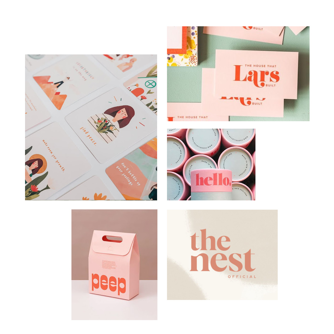
In this early spring month we can see a big difference in vibrancy from the one before. This month is all about tender new beginnings. Fresh starts, new ideas, just getting up and going, a little wobbly but very optimistic. There is an innocent purity to the overall feeling.
Elements that relate to branding this month are plumped up fonts that are either san serif or serif that have a bouncy feeling to them, rounded lines but with movement, a much more extensive color palette, closer typography spacing, softer and youthful editorial styling embodying optimism and hope.
If your business seems to resonate with these words and images, then this early spring vibe may be just the right fit for your brand identity. It is uplifting, playful, simple, animated and hand crafted adding fun in a way no other month can.
The credits for the moodboard images can be found here.


