Hello lovelies,
With the third installment in the ‘restorative spaces’ series we venture into Autumn with September. You can catch up with July here and August here.
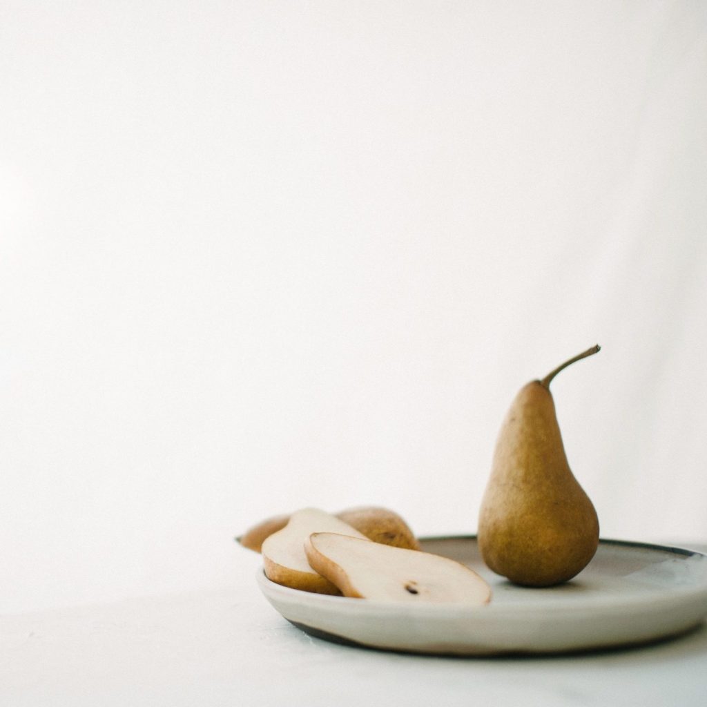
As a reminder seasonal color psychology is the study of color and how it’s tones and traits are mirrored in nature and can be relatable to nearly every aspect of design .. design in nature, fashion, interiors, print, florals, art etc. Here is a peek at the September color psychology mood board if you would like to see it.
As we move away from Summer, the color palette warms up and this brings a more cozy feeling. There is still a touch of the formality and refinement that lingers from Summer, but the feelings of comfort and welcome have more emphasis.
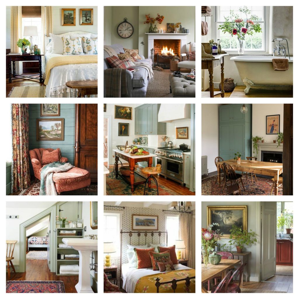
Regarding interiors for the first month in Autumn; we move from symmetry to asymmetry in many instances, as this creates more visual movement. Furnishings feel more sturdy and grounded with darker woods and richer paint finishes. There are more layers; in linens, accessories, patterns and textures. Colors are deeper and richer. Patterns tend to be more traditional; in dense florals, quilt geometrics, mid-size plaids and stripes. Natural fibers of wool, chenille, mohair and hardy cottons feature in the overall look.
This moodboard and the nine images shown are on my Pinterest board ‘colour psychology – september’ .. please explore the pins further if you would like to.
